WoodWing Design System
Reusable buttons, icons, fonts, illustrations and more

Team Lead - UI Design
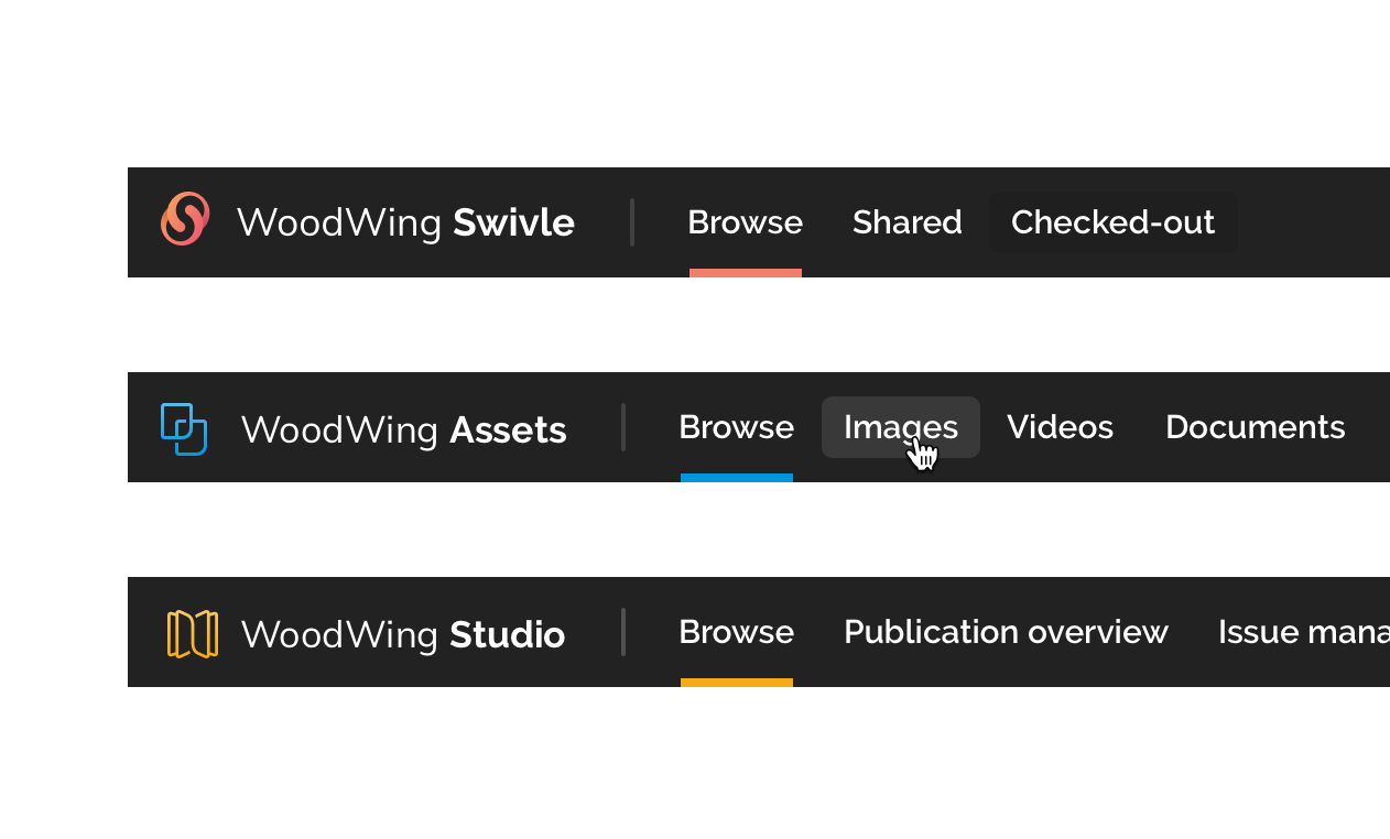
About WoodWing Software
WoodWing is a developer offering solutions for content and information management. A content creation tool for the publishing industrie, a Digital Asset Management system, a document processing tool and a tool that gives employees access to all internal processes and documents from its employer.
Inconsistencies
When I started working for WoodWing, I noticed numerous inconsistencies among the applications they offered, both in user experience and aesthetics, sometimes even within a single application. Since 2019, my plan has been to establish a central repository for all components and guidelines used in product development. This approach allows us to maximize reusability and ensure consistency not only within individual applications but also across different ones. Although it took a few years to gain consensus and recognize the benefits, we finally began the implementation phase.
Designing a design system
Leading the design team we started brainstorming, researching and sketching design systems. We came a cross the Atom design approach where you start with the smalles component (atoms) and start to combine those to create more complex components (molecules and organisms). This felt the way to go, and this resulted in the following shared components.

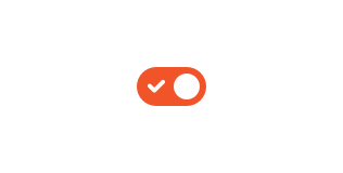
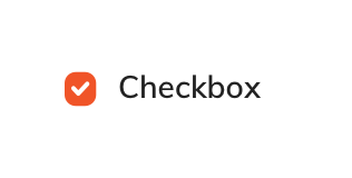
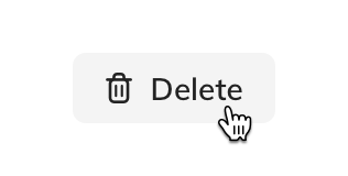
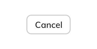

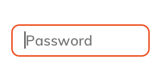

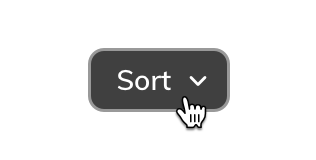
Shared components
These are just a few of the components we designed for the Design System. All components have a complete set of states like a normal, hover, active, selected, focus and a disabled state. These where all custom designed and build, without the use of an exciting library like Google material. This made the progress very slow.


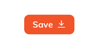
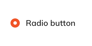
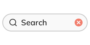
Components
These are just a few of the components we designed for the Design System. And of course all components have the nessesairy states like the normal state, the hover state a selected state a disabled state and more.

Colors
A limited set of colours for all applications. We went from 150+ colors for one application to 28. Creating a visually simplified and more coherent look and feel to the user interface.
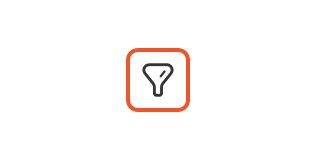
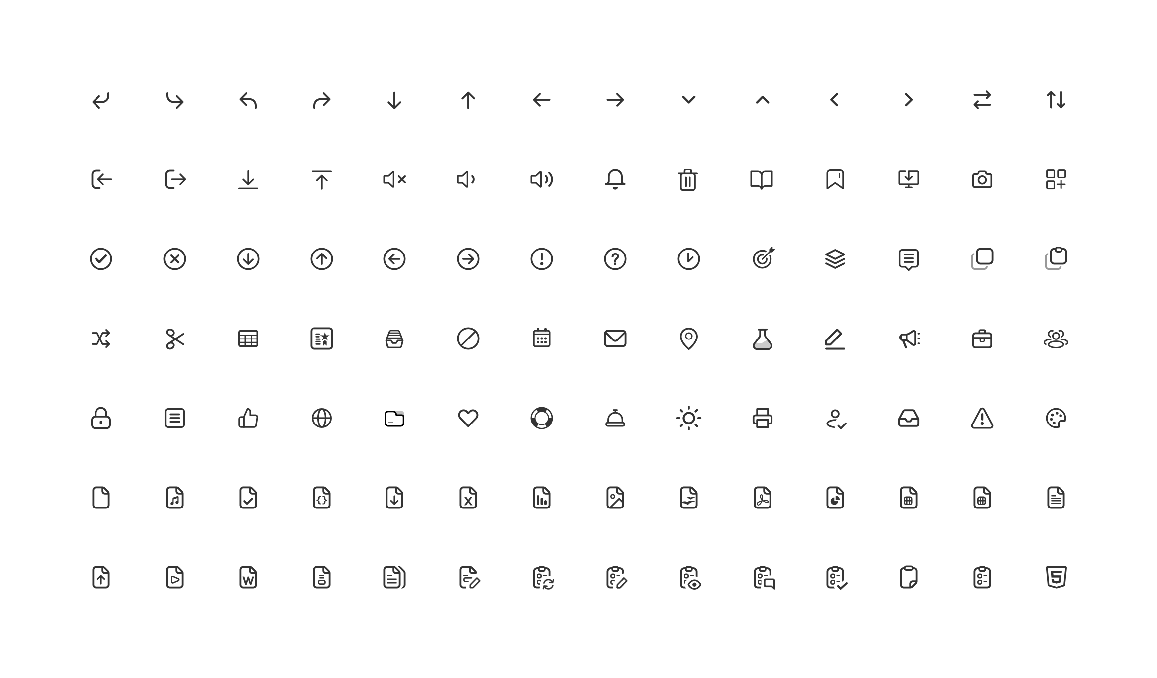
Icongraphy
Over 200 custom-made icons were created to add a personal touch, available in two sizes for use within the interface, buttons, and context menus.
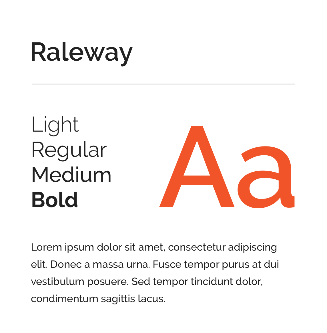
Typography
Raleway - a great headline font with a lot of character and detail. This font us used a lot for marketing uitingen. In the applications it is used for the main navigation and as titles for some popups or messages.
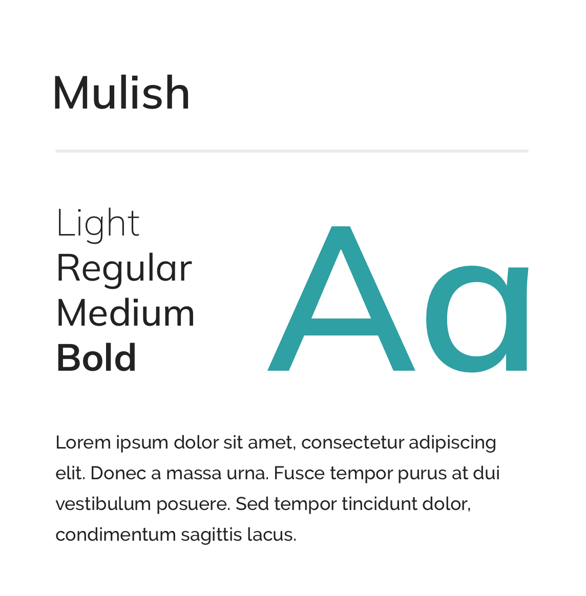
Mulish - Was chosen for it’s great readability on small sizes, especially on screens. It is used by marketing as a body text font but in our applications it is used everywhere. In buttons, tooltip, small titels


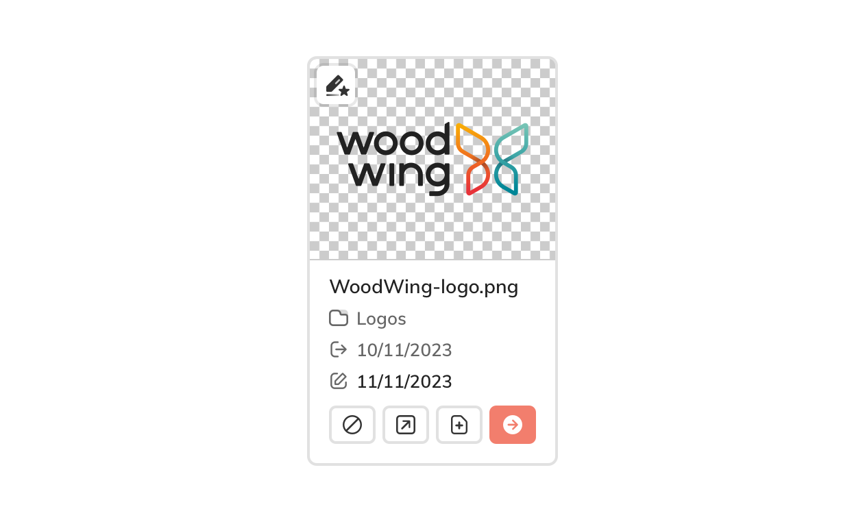
Illustrations
These are just a few of the components we designed for the Design System. And of course all components have the nessesairy states like the normal state, the hover state a selected state a disabled state and more.
In addition to those, the Design System also included::
Animations
Keyboard shortcuts
Interaction Patterns
A grid and spacing system
Accessibility Guidelines
My role
Leading the design team I introduced a different mindset about designing software like we did before to the team. Can we create one central location for all components, guidelines and more? It took a few years for our colleagues to see the value in this approach but we are finally building software using the Design System.
Next to that I created all the visual designs for this project and keep improving the components as we use them more.
